
分享兴趣,传播快乐,增长见闻,留下美好!
亲爱的您,这里是LearningYard新学苑。
今天小编为大家带来华硕前端16-css的grid布局,欢迎您的访问。
Share interests, spread happiness, increase knowledge, and leave a good legacy!
Dear you, this is The LearningYard Academy.
Today Xiaobian brings you the knowledge sharing of Knowledge set | allocation of operations research resources, welcome to your visit.
今天我们来讲一讲css中的grid布局。
Grid布局又叫网格布局,十分强大,所以我们还是更加倾向于使用grid布局来编写网页。
首先在学习前我们要回顾一下什么是表格其格式为<table><tr><td></td>></tr>,这就形成了一个格子,其中tr是行,td是列。同理网格布局(Grid)是最强大的 CSS 布局方案。
它将网页划分成一个个网格,可以任意组合不同的网格,做出各种各样的布局。以前,只能通过复杂的 CSS 框架达到的效果,现在浏览器内置了。
Today, let's talk about grid layout in css.
Grid layout, also called grid layout, is very powerful, so we still prefer to use grid layout to write web pages.
First, before learning, we should review what a table is, and its format is < table > < tr > < td > </TD > >, which forms a grid, where TR is a row and TD is a column. Similarly, Grid is the most powerful CSS layout scheme.
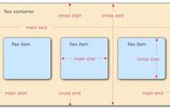
Grid 布局与 Flex 布局有一定的相似性,都可以指定容器内部多个项目的位置。但是,它们也存在重大的区别。
Flex 布局是轴线布局,只能指定"项目"针对轴线的位置,可以看作是一维布局。Grid 布局则是将容器划分成"行"和"列",产生单元格,然后指定"项目所在"的单元格,可以看作是二维布局。Grid 布局远比 Flex 布局强大。
采用网格布局的区域,称为"容器"(container)。容器内部采用网格定位的子元素,称为"项目"(item)。
Grid layout is similar to Flex layout, which can specify the location of multiple items in the container. However, there are important differences between them.
Flex layout is axis layout, and only the location of "project" against axis can be specified, which can be regarded as one-dimensional layout. Grid layout divides the container into "rows" and "columns", generates cells, and then specifies the cell where the project is located, which can be regarded as a two-dimensional layout. Grid layout is far more powerful than Flex layout.
The area with grid layout is called "container". The sub-elements located in the container by grid are called "item".
这一个点和flex布局很像,就是当我把父元素设置了flex布局/grid布局,那么里面的直接子元素就会自动变成flex/grid元素,也是就说父元素就似乎“容器”,直接子元素就是“项目”,Grid 布局的属性分成两类。一类定义在容器上面,称为容器属性;另一类定义在项目上面,称为项目属性。
This point is very similar to flex layout, that is, when I set the parent element to flex layout /grid layout, the direct child elements in it will automatically become flex/grid elements, which means that the parent element seems to be a "container" and the direct child elements are "projects". The attributes of Grid layout are divided into two categories. A class defined on the container is called container attribute; The other is defined on the project, called project attributes.
定义grid布局容器,就是给所需要的元素display:grid/inline-grid
这一个点和flex布局很像.
grid属性值:就是定义此容器为块级元素(常用)
inline-grid属性值:就是定义此容器为行内块元素(不常用)
注意:设为网格布局以后,容器子元素(项目)的float、display: inline-block、display: table-cell、vertical-align和column-*等设置都将失效。
To define the grid layout container is to display:grid/inline-grid for the required elements.
This point is very similar to the flex layout.
Grid attribute value: this container is defined as a block-level element (commonly used).
Inline-grid attribute value: it is to define this container as an inline block element (not commonly used)
Note: After setting to grid layout, the settings of float, display: inline-block, display: table-cell, vertical-align and column-* of the sub-elements (items) of the container will be invalid.
今天的分享就到这里了。如果您对今天的文章有什么独特的想法,欢迎评论留言,让我们相约明天,祝您今天过得开心快乐!
That's it for today's sharing. If you have any unique ideas for today's article, please leave a comment, let us meet tomorrow, I wish you a happy day!
翻译:Google翻译
本文由LearningYard新学苑原创,部分图片文字来自网络,如有侵权请联系。
文字&排版|李仕阳
审核|闫庆红