实现水平垂直同时居中我们可以使用绝对定位、table布局、flex布局 或 grid布局来实现。
首先我们创建一个需要居中的盒子。
<div class="box"></div>
纯绝对定位
.box {
  position: absolute;
  width: 200px;
  height: 100px;
  background: red;
  top: 0;
  left: 0;
  right: 0;
  bottom: 0;
  margin: auto;
}
点击查看代码运行实例
绝对定位加负外边距这种方式需要知道居中元素的具体宽高,不然负的margin没法设置。
.box {
  position: absolute;
  width: 200px;
  height: 100px;
  background: red;
  left: 50%;
  top: 50%;
  margin-left: -100px;
  margin-top: -50px;
}
点击查看代码运行实例
绝对定位加平移这种平移的方式就不需要考虑居中盒子的具体宽高了。
.box {
  position: absolute;
  width: 200px;
  height: 100px;
  background: red;
  left: 50%;
  top: 50%;
  transform: translate(-50%, -50%);
}
点击查看代码运行实例
使用flex实现html,body {
height: 100%;
}
body {
background: gray;
display: flex;
align-items: center;
justify-content: center;
}
.box {
width: 200px;
height: 100px;
background: red;
}
点击查看代码运行实例
使用grid实现html,body {
height: 100%;
}
body {
background: gray;
display: grid;
/* align-content: center;
justify-content: center; */
/* align-content和justify-content的简写 */
place-content: center;
}
.box {
width: 200px;
height: 100px;
background: red;
}
点击查看代码运行实例
使用table加外边距实现使用table布局需要注意如下
- display: table时padding会失效
- display: table-row时margin、padding同时失效
- display: table-cell时margin会失效
<div class="box">
  <div class="child"></div>
</div>
.box {
  background: red;
  height: 300px;
  width: 600px;
  display: table-cell;
  vertical-align: middle;
}

.child {
  width: 200px;
  height: 200px;
  background: lightgreen;
  margin: 0 auto;
}
点击查看代码运行实例
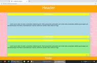
单栏布局单栏布局我们常用在网页框架上,一般我们把网页分为 header、content、footer三部分。

在不同的项目我们可能对这三部分的样式需求有所差别,比如需要顶部固定、需要底部固定等等。
顶底部都不固定比如想实现如下效果,footer在内容不足的时候吸附在窗口底部,当内容多的时候又可以被抵到窗口下面。

<div class="wrap">
  <div class="header">header</div>
  <div class="content">content</div>
</div>
<div class="footer">footer</div>
html, body {
  height: 100%;
  margin: 0;
}

.wrap {
  min-height: 100%;
  padding-bottom: 50px;
  overflow: auto;
  box-sizing: border-box;
}

.header {
  height: 50px;
  background: lightblue;
}

.content {
  background: lightpink;
  /* 这里的高度只是为了模拟内容多少 */
  height: 100px;
  /*  height: 1000px; */
}

.footer {
  height: 50px;
  background: lightgreen;
  margin-top: -50px;
}
点击查看代码运行实例
使用flex实现<div class="wrap">
<div class="header">header</div>
<div class="content">content</div>
<div class="footer">footer</div>
</div>
html, body {
  height: 100%;
  margin: 0;
}

.wrap {
  display: flex;
  flex-direction: column;
  min-height: 100%;
}

.header {
  height: 50px;
  background: lightblue;
}

.content {
  background: lightpink;
  /* 这里的高度只是为了模拟内容多少 */
  height: 100px;
  /* height: 1000px; */
  flex-grow: 1;
}

.footer {
  height: 50px;
  background: lightgreen;
}
点击查看代码运行实例
顶部固定使用padding加负margin加fixed实现顶部固定布局<div class="header">header</div>
<div class="wrap">
<div class="content">content</div>
</div>
<div class="footer">footer</div>
html, body {
  height: 100%;
  margin: 0;
}

.header {
  height: 50px;
  background: lightblue;
  position: fixed;
  width: 100%;
}

.wrap {
  min-height: 100%;
  padding-bottom: 50px;
  overflow: auto;
  box-sizing: border-box;
}

.content {
  margin-top: 50px;
  background: lightpink;
  /* 这里的高度只是为了模拟内容多少 */
  height: 100px;
  /* height: 1000px; */
}

.footer {
  height: 50px;
  background: lightgreen;
  margin-top: -50px;
}
点击查看代码运行实例
使用flex加fixed定位实现<div class="wrap">
<div class="header">header</div>
<div class="content">content</div>
<div class="footer">footer</div>
</div>
html, body {
  height: 100%;
  margin: 0;
}

.wrap {
  display: flex;
  min-height: 100%;
  flex-direction:column;
}

.header {
  height: 50px;
  background: lightblue;
  position: fixed;
  width: 100%;
}

.content {
  background: lightpink;
  /* 这里的高度只是为了模拟内容多少 */
  /* height: 100px; */
  height: 1000px;
  margin-top: 50px;
  flex-grow: 1;
}

.footer {
  height: 50px;
  background: lightgreen;
}
点击查看代码运行实例
底部固定使用padding加负margin实现底部固定布局<div class="wrap">
<div class="header">header</div>
<div class="content">content</div>
</div>
<div class="footer">footer</div>
html, body {
  height: 100%;
  margin: 0;
}

.wrap {
  height: 100%;
  padding-bottom: 50px;
  overflow: auto;
  box-sizing: border-box;
}

.header {
  height: 50px;
  background: lightblue;
}

.content {
  background: lightpink;
  height: 100px;
  height: 1000px;
}

.footer {
  height: 50px;
  background: lightgreen;
  margin-top: -50px;
}
点击查看代码运行实例
使用flex加fixed定位实现<div class="wrap">
<div class="header">header</div>
<div class="content">content</div>
<div class="footer">footer</div>
</div>
html, body {
  height: 100%;
  margin: 0;
}

.wrap {
  display: flex;
  min-height: 100%;
  flex-direction:column;
}

.header {
  height: 50px;
  background: lightblue;
}

.content {
  background: lightpink;
  /* 这里的高度只是为了模拟内容多少 */
  /* height: 100px; */
  height: 1000px;
  flex-grow: 1;
  margin-bottom: 50px;
}

.footer {
  height: 50px;
  background: lightgreen;
  position: fixed;
  width: 100%;
  bottom: 0;
}
点击查看代码运行实例
顶底部都固定使用fixed实现顶底部固定布局<div class="header">header</div>
<div class="content">content</div>
<div class="footer">footer</div>
复制代码
html, body {
  height: 100%;
  margin: 0;
}

.header {
  height: 50px;
  background: lightblue;
  position: fixed;
  width: 100%;
}

.content {
  background: lightpink;
  padding-top: 50px;
  padding-bottom: 50px;
  /* height: 100px; */
  height: 1000px;
}

.footer {
  height: 50px;
  background: lightgreen;
  position: fixed;
  bottom: 0;
  width: 100%;
}
点击查看代码运行实例
使用flex加fixed定位实现<div class="wrap">
<div class="header">header</div>
<div class="content">content</div>
<div class="footer">footer</div>
</div>
html, body {
  height: 100%;
  margin: 0;
}

.wrap {
  display: flex;
  min-height: 100%;
  flex-direction:column;
}

.header {
  height: 50px;
  background: lightblue;
  position: fixed;
  width: 100%;
}

.content {
  background: lightpink;
  /* 这里的高度只是为了模拟内容多少 */
  /* height: 100px; */
  height: 1000px;
  flex-grow: 1;
  margin-bottom: 50px;
  margin-top: 50px;
}

.footer {
  height: 50px;
  background: lightgreen;
  position: fixed;
  width: 100%;
  bottom: 0;
}
点击查看代码运行实例
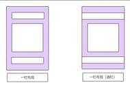
两栏布局两栏布局就是一边固定,另外一边自适应,效果如下

实现两栏布局的方法也有很多,笔者接下来介绍用的比较多的几种方式。
左 float,然后右 margin-left(右边自适应)<div class="aside"></div>
<div class="main"></div>
div {
height: 500px;
}
.aside {
width: 300px;
float: left;
background: yellow;
}
.main {
background: aqua;
margin-left: 300px;
}
点击查看代码运行实例
右 float,然后右 margin-right(左边自适应)<div class="aside"></div>
<div class="main"></div>
div {
height: 500px;
}
.aside {
width: 300px;
float: right;
background: yellow;
}
.main {
background: aqua;
margin-right: 300px;
}
点击查看代码运行实例
absolute定位加margin-left(右边自适应)<div class="wrap">
<div class="aside"></div>
<div class="main"></div>
</div>
div {
height: 500px;
}
.wrap {
position: relative;
}
.aside {
width: 300px;
background: yellow;
position: absolute;
}
.main {
background: aqua;
margin-left: 300px;
}
点击查看代码运行实例
absolute定位加margin-right(左边自适应)<div class="wrap">
<div class="aside"></div>
<div class="main"></div>
</div>
div {
  height: 500px;
}

.wrap {
  position: relative;
}

.aside {
  width: 300px;
  background: yellow;
  position: absolute;
  right: 0;
}

.main {
  background: aqua;
  margin-right: 300px;
}
点击查看代码运行实例
使用flex实现<div class="wrap">
<div class="aside"></div>
<div class="main"></div>
</div>
div {
  height: 500px;
}

.wrap {
  display: flex;
}

.aside {
  flex: 0 0 300px;
  background: yellow;

}

.main {
  background: aqua;
  flex: 1 1;
}
点击查看代码运行实例
使用grid实现<div class="wrap">
<div class="aside"></div>
<div class="main"></div>
</div>
  height: 500px;
}

.wrap {
  display: grid;
  grid-template-columns: 300px auto;
}

.aside {
  background: yellow;

}

.main {
  background: aqua;
}
点击查看代码运行实例
三栏布局三栏布局就是两边固定,中间自适应布局,效果如下